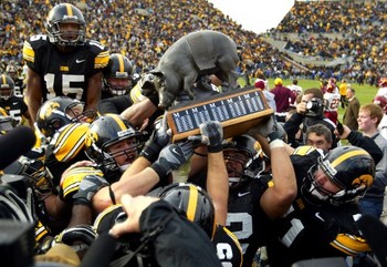
Well if you thought people would be warming to the new Cy-Hawk trophy after a couple of days, I present James from Des Moines email tonight:
"The new Cy-Hawk trophy makes me want to hate myself."
Hopefully that was in jest because a lot of people are going over the top with this. I don't think this trophy was designed with the intent to piss off 96 percent of the state. There is some superb craftsmanship as well. Would look great in an art gallery. And why, if people are so up in arms over this, aren't we hearing more blame placed on the athletic departments? They signed off on it and, one would think, had to have some idea/input on the design of this thing.
 |
| Memo To Iowa Corn Growers-KEEP IT SIMPLE! |
Keith has hit the nail on the head in saying the Iowa Corn Growers Association folks have a chance for golden PR if they change the trophy. And frankly I think even a small change would be acceptable: replace the corn that the dad is handing to the son with a football. Keep the basket of corn in the photo to satisfy the corporate deal. Would it still be a big honking trophy? Yes, but at least it would make some football sense and maybe even represent a tradition of sorts in Iowa (and across the country): a father introducing a son to football.
Problem is I just don't think Iowa Corn Growers will make this or any other change. They seemed to have gone to Defcon 1 lockdown. They let their money do the talking and, as another emailer pointed out, they could do what they want:
"If my company put up the money for the sponsorship, I'd have a life size pewter replica of my rear end. Then if people didn't like it, well they could just kiss it!"
Perhaps one of the faces of football in Iowa, Hayden Fry, said it best to the Des Moines Register:
"It's a nice-looking trophy. And the farmer, family and corn is all wonderful," said Fry, pausing, "but I don't really get the relationship to a football game."
Iowa State held their fanfest today and had a great turnout. One thing that surprises me is how quickly the "I-State" logo and branding has caught on. I really didn't see anybody there who had the old logos. Surprises me a bit that it's been so embraced, especially since it came about thanks to one of the all time ISU villains, Gene Chizik. A win for the marketing department at Iowa State I guess. I personally always liked the bird in the tornado more. And ISU beat the Hawks five games in a row at one point with that logo. Their winless with the new one (the win in 07 was actually in throwback unis, as if any of this matters).
My twitter got hit with a phishing virus today, so rest assured I don't have some photo of you that I'm ROFL'ing over. If I could ever get a hold of the the zit-faced kid who creates these stupid viruses out of frustration for never having gotten laid I would KHSA (hint, first word is KICK)......


No comments:
Post a Comment